Brief Overview
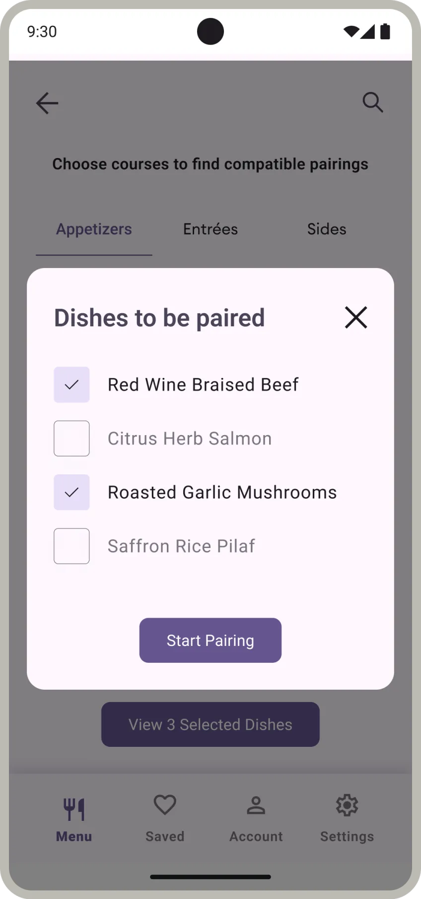
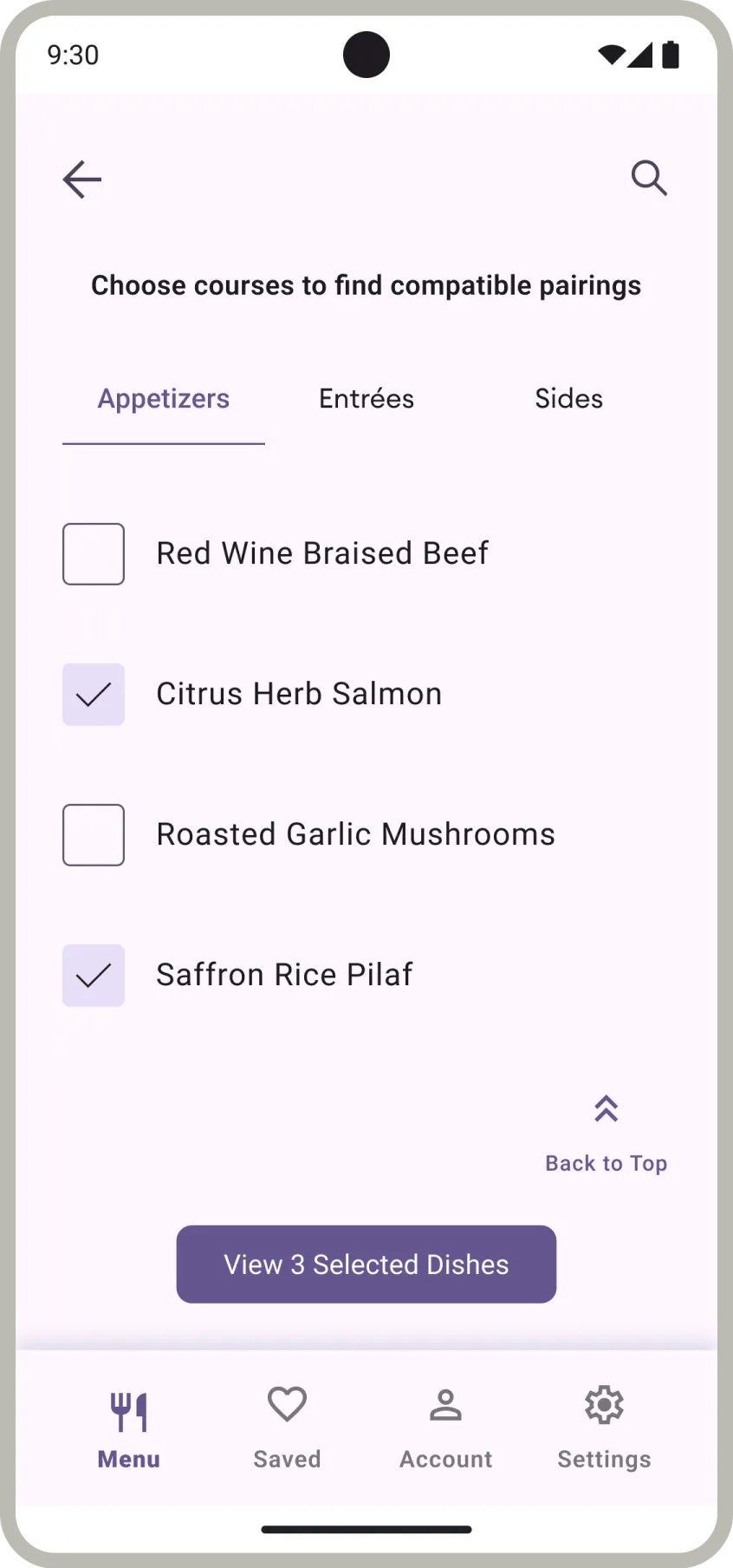
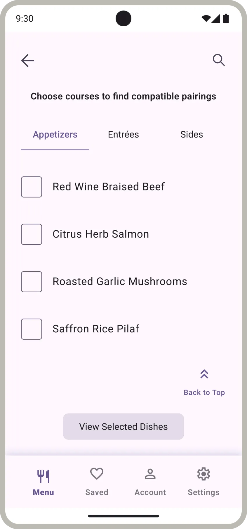
I revamped a wine-pairing startup’s web and app UI/UX, addressing issues and enhancing visual appeal. I streamlined the user flow, improved onboarding, and aligned the design with a modern aesthetic.
Objectives
Redesign visual identity, streamline UX, and boost brand awareness. I made the app more user-centric and personalised for wine enthusiasts.
Process and Methodology
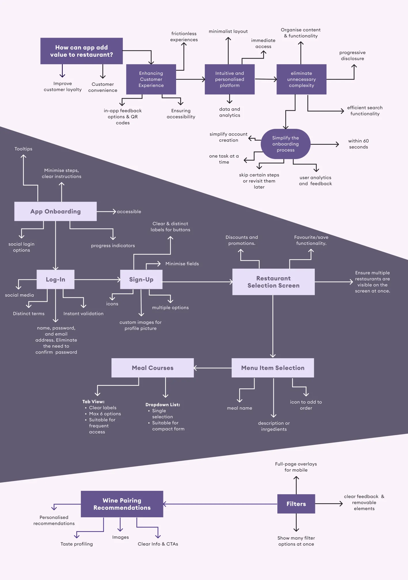
- Analysed client’s Miro board.
- Conducted UX research and gathered inspiration.
- Created lo-fi wireframes in Figma.
- Developed modern and vintage mood boards, and gathered feedback.
- Designed high-fidelity wireframes, and iterated with feedback.
- Collaborated with developers, and tested designs.

Tools and Software
- Figma
- Miro
- Material Theme Builder
- Material Design components.
Techniques
- Figma Variables
- Auto Layout
- Components & Variants
- Corner Radius
- Hug and Fill Sizing
- Absolute Positioning
Challenges and Solutions
Lack of early communication led to scope confusion. Flutter limitations also posed issues. I provided both modern and traditional styling options, maintained feedback loops, and worked closely with developers to ensure alignment.
Outcome and Reflection
Positive feedback and increased user engagement. The design was praised for modern aesthetics and user-centricity. I learned to involve clients and developers early to ensure clear goals, and improved efficiency using design systems and components.


