Brief Overview
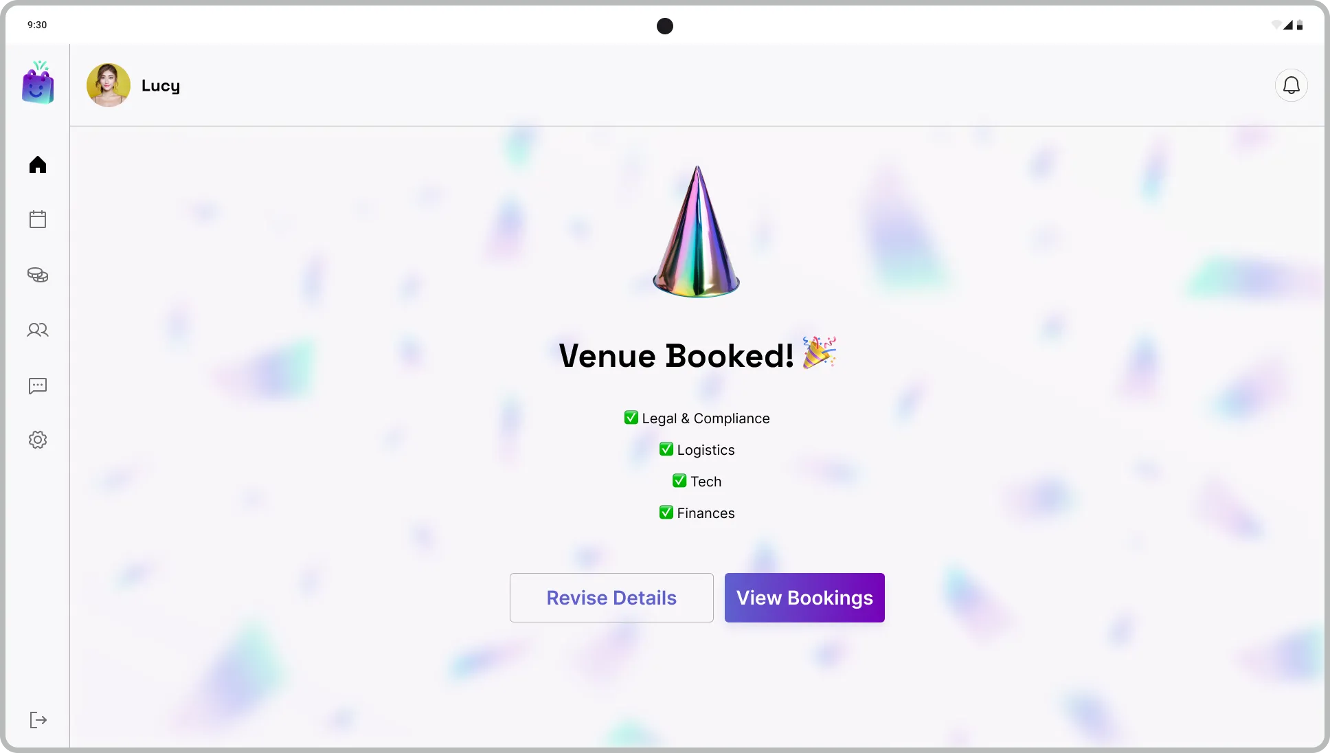
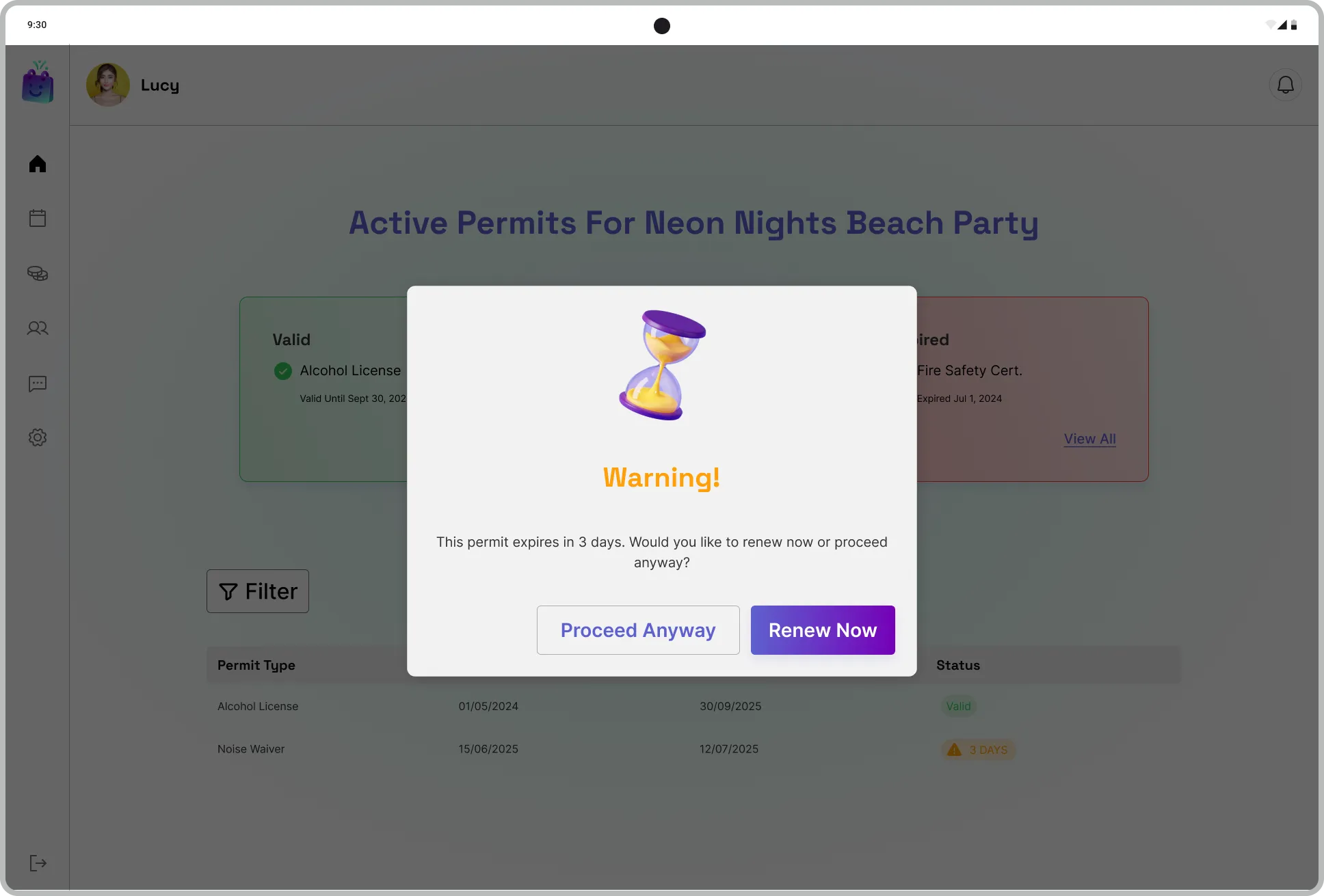
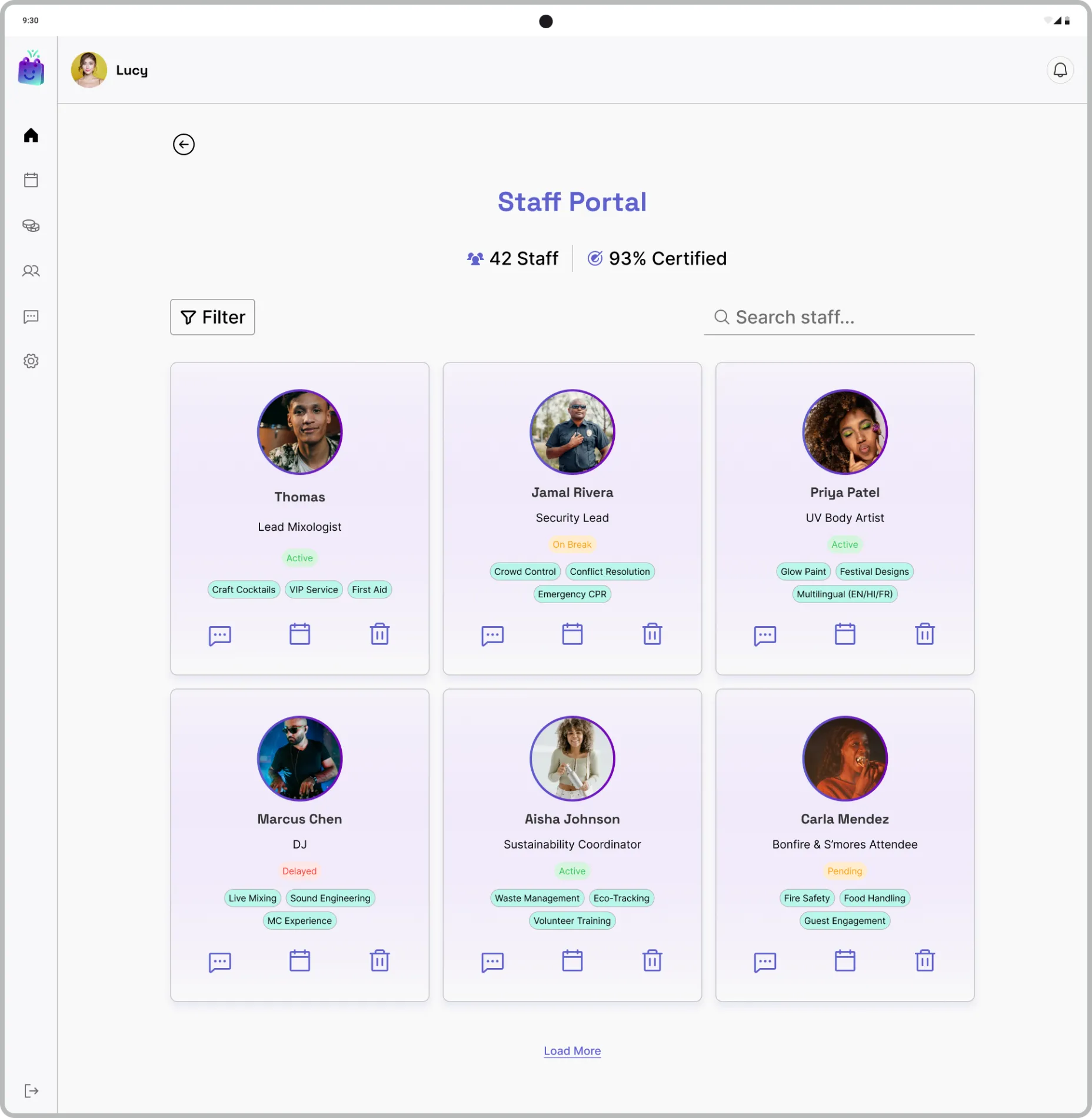
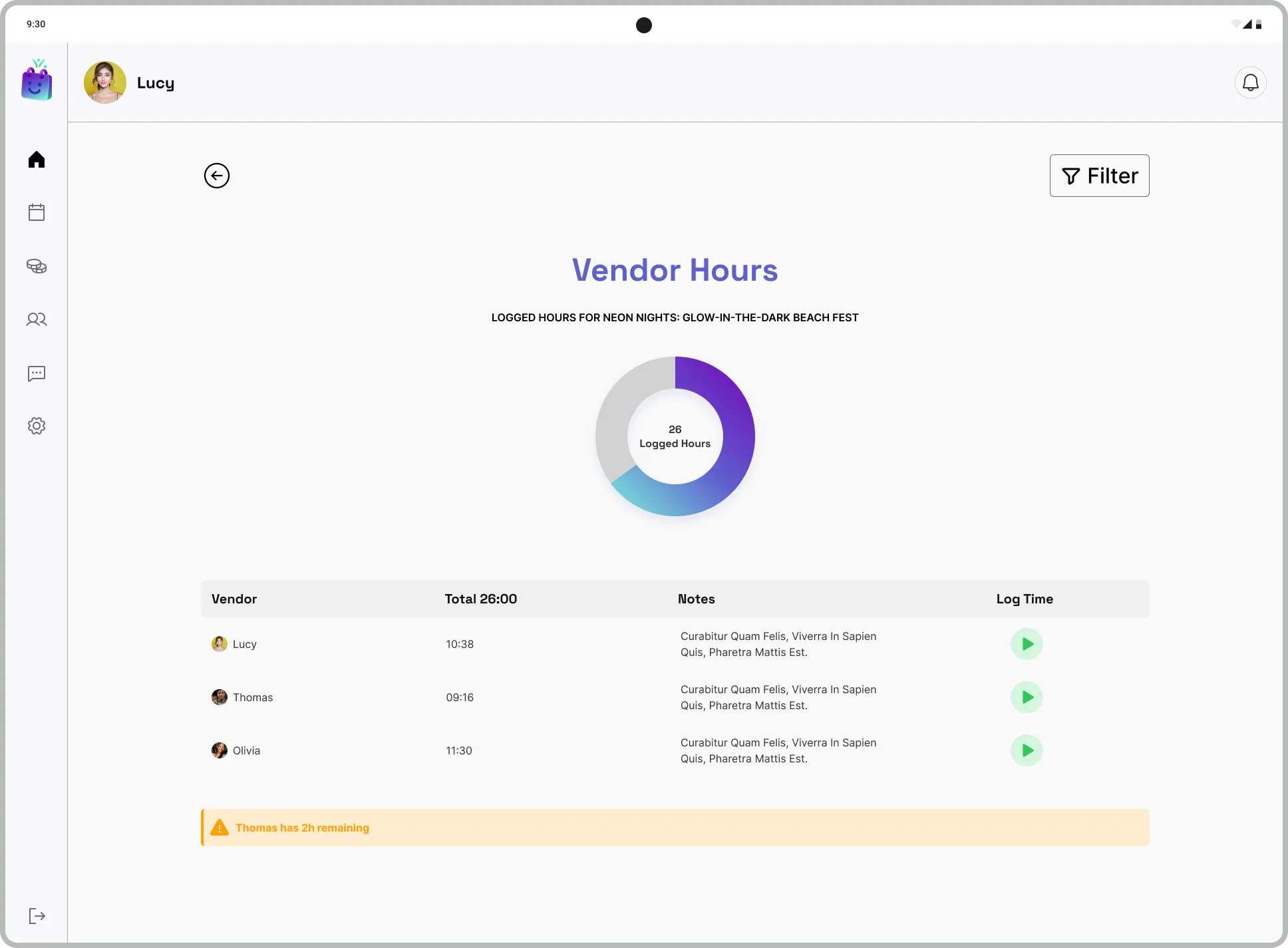
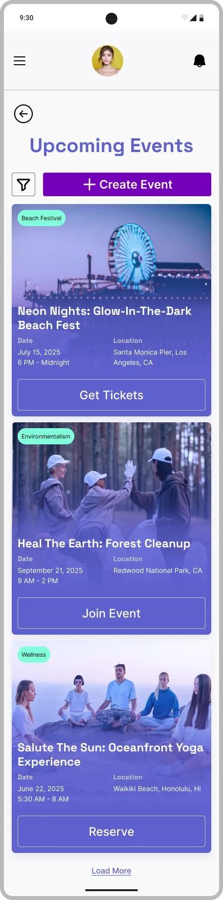
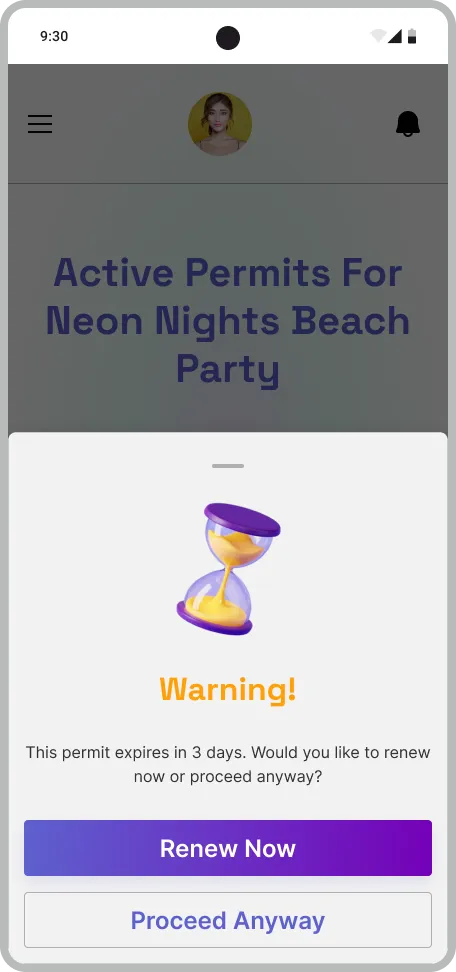
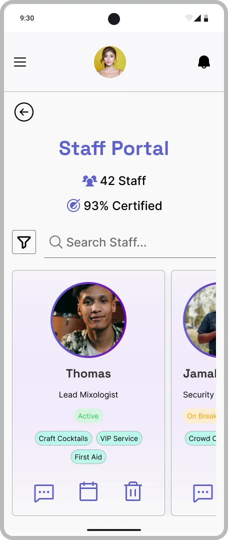
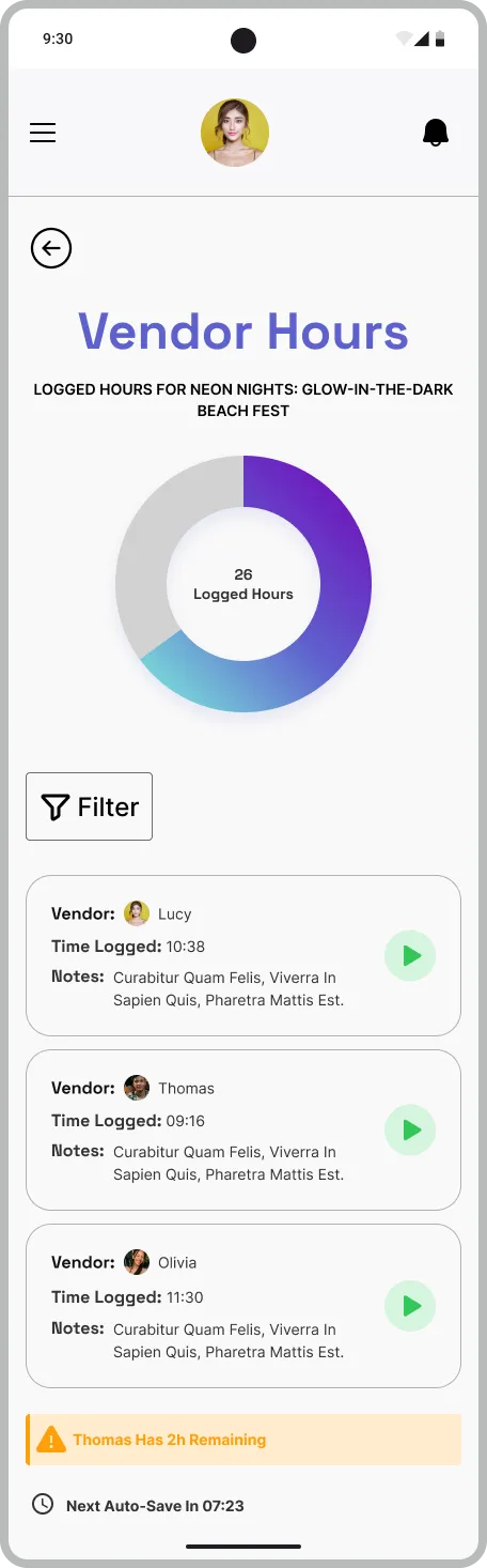
Designed a Figma-based dashboard system enabling users to book venues, monitor staff hours, track permit expirations, and organise diverse events (festivals, wellness groups, volunteering). I integrated tags, filters, and milestone celebrations to simplify multi-event management. The target audience is event planners, team leaders, and organisers juggling logistics across multiple events.
Objectives
- Unify calendars, permits, staff tracking, and event creation in one platform.
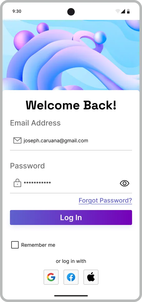
- Ensure mobile-friendly responsiveness.
- Maintain consistent branding across all screens.
Process and Methodology
- Analysed dashboard UX best practices and event-planning pain points.
- Curated vibrant colour palettes and legible fonts balancing “fun” and functionality.
- Built a scalable design system with accessible components and spacing, colour roles, and typography guidelines.
- Prioritised critical screens (event hub, staff portal, permit alerts).
- Refined interactions through iterative prototyping.
Tools
- Figma
- Freepik
- Color Palette
- WebAIM.com for contrast checking
- Phosphor Icons set from the Figma Community
Techniques
- Figma variables and styles
- Glass morphism
- Auto layout
- Gradients
- Shadows
Challenges and Solutions
This was my first time designing a dashboard with an unfamiliar visual style. I simplified layouts through research, focusing on clarity over complexity.
Reflection
I designed a cohesive system reducing reliance on external apps for staff/hour tracking. I also improved on scalable design systems and learned to prioritise iterative progress over perfectionism.